Web banner ads are great tools to spread a message to a large audience online, and a lot of companies use banner advertising to get relevant information to the right users. In addition to offline marketing tools such as acrylic signs, web banner ads help to draw attention to a particular business or brand.
With web banner ads, it is as important to stand out and make a great impression. Here are 5 examples of brands that have made great impressions with their banner ads. Each of them can inspire and teach anyone the elements of great web banner ads.
1) Coca Cola
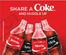
Coca Cola is a brand that keeps things simple and this banner ad is no exception. It contains all the elements a proper banner ad requires- the product, logo and a short message all within a box in the brand’s colour. Simplicity is key to optimizing a banner ad for the web because filling a banner with too much information is counter productive. Stick to only important information and elements should be added to a banner ad to make it catchy and attention-grabbing.
It is also important to use a simple font pairing just like in this Coca Cola banner. Different line weights of the same font were used in the message apart from the ‘Coke’ written in its trademark font. If these words had all been depicted in the exact same weight and size, it may have fallen flat and not have as much impact in its design and content.
2) Disney Resort Hotels
One important point to note in this banner ad is the art of showing and not telling. Instead of describing the amount of fun to expect, there is a picture of a child having fun with his mother. This is more convincing than words.
The banner is motion oriented making it eye catching. Movement catches the eye outside of the web and would do so online as well. The message is also simple and straightforward so as not to overcomplicate the banner.
The first message on the banner ad says ‘Welcome to Mahalo Season’, making potential customers feel warm and welcome before even clicking on the ad.
3) Honda
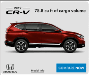
This banner ad for Honda uses shadows to anchor the image down. The shadow underneath the car adds in dimension to the ad, ensuring it is not too flat or two-dimensional. It also adds in depth and ground to the vehicle. If it were not there, the car would look like it was simply pasted on and was floating and would not pop out quite as much.
The banner has a nice contrast, which is a good way to draw attention.The background is light and crisp while the picture of the car is dark and textured. This contrast really makes the car, which is the focus of the banner ad, stand out. This is a very creative way to create a relationship between the elements of a banner and to accentuate it.
4) Nike
In this banner, Nike appeals to its niche of athletes. The banner ad contains a picture of an athlete training on a running track with all his work out essentials from Nike, of course. The picture on the banner also makes a reference to the target market’s lifestyle of working out and training. An athlete scrolling through the web would definitely be drawn to a banner with a picture of another athlete training on a running track. This fulfills the ultimate goal of the banner ad getting to the right set of people.
The banner ad has the element of motion, making it eye catching. The message of the ad is straightforward and direct with a simple call-to-action. All these elements together make this banner ad effective
5) Google
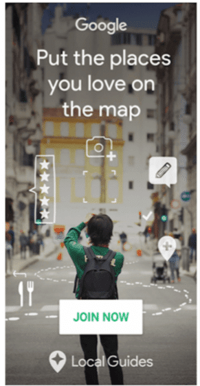
Google created this form of advertising and is definitely a force to be reckoned with in the world of banner ads. This particular banner ad brings in a nice and personal touch with its hand drawn icons. It looks as if the person in the photo were writing out his actions for the world to see. These hand drawn features makes the ad personal.
This banner incorporates the element of motion as well as a simple font pairing. Each element of this banner ad has its own strength and contributes something which would otherwise be missed if it were not there.
These examples not only show how these large brands design their web banner ads but also showed how they use these banner ads to gain users, increase profit and have an impact on their industry. In a world of obnoxious and lazy web banner ads, it is necessary to make your web banner catchy and worth the click.
